Brand, design and build of a whole new Drupal website

Earth observation, oceanography, atmospheric science, climate science, marine science, terrestrial science, freshwater science, geology, and physics of the sun and space are some of the areas covered by the Environmental Data Service (EDS), a part of UK Research & Innovation (UKRI).
Their raison d'être is to oversee the networked data centres with domain-specific expertise that make up the EDS network, specifically:
- British Oceanographic Data Centre (Marine)
- Centre for Environmental Data Analysis (Atmospheric, Earth Observation, and Solar and space physics)
- Environmental Information Data Centre (Terrestrial and freshwater)
- National Geoscience Data Centre (Geoscience)
- UK Polar Data Centre (Polar and cryosphere)
Whilst the data centres have individual discipline specific expertise, they pull together decades of experience to provide an integrated shared service that works across all domains.
EDS hosts the largest collection of environmental science data in the UK to support researchers and everyone interested in learning more about the natural world. Ensuring that environmental data is available, accessible, and re-usable indefinitely is their top priority.
Why Drupal?
When it came to choosing a CMS, EDS was ready to adopt the latest version of Drupal. They understood that the CMS can support the desired front-end aesthetic while also providing a simple back-end administration experience. Drupal emerged as the preferred platform from the start.
What we did
Although EDS had existed for some time, they never had their own brand - just a corner on the UKRI website. So our first job was to provide branding for the organisation, based on the UKRI's existing brand guidelines. Following on from that we were able to interpret the branding we created into proper web design guidelines we could apply to their new Drupal website. We were also responsible for maintaining and making available environmental data collected by various different organisations.
We started with a systematic review of the existing site, users, workflow, and website goals. We then collaborated on a discovery period with workshops and meetings to prepare a needs assessment and identify solutions. With so many stakeholders involved, getting consensus was challenging, but our EDS partners were brilliant at steering the project through that and achieving sign-off on branding, design, and other crucial decisions that needed making prior to a build.
Custom code development
Although we always try to re-use existing modules whenever we can, sometimes you have to roll your sleeves up. On the plus side, these are the scenarios that present opportunities to contribute to open source software.
For example, we developed the Drupal 9 version of the contributed module for Help Scout and their Beacon messenger tool. The module provides basic integration with Beacon - a help-desk tool (similar to Zoho Desk or Zendesk), allowing people to submit support tickets or chat from a Drupal site.
EDS has everything centralised using Help Scout (FAQs, Webforms, etc.) so we had to integrate it with Drupal, and of course, we gave the code back to the Drupal community.
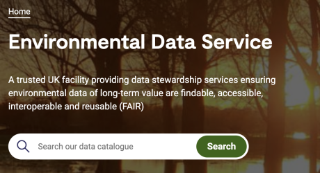
Integration with the NERC Data Catalogue service was also required and was custom code. It is an external site working as a meta catalogue for combined data and you can now search it directly from the homepage of their website, just use the search bar in the banner.
Content Admin
The design strategy discussion resulted in us providing various templates (using the Paragraphs module) that could be used to assemble content with flexibility and ease, thereby reducing the need for a developers/designers to be involved with standard content entry tasks and page building.
Workflow
We implemented a streamlined and sustainable content workflow process to allow for a growing number of users, different content states, smoother revision monitoring, and more granular control over content permissions. The new system allowed for greater oversight and review, allowing content to be managed and repurposed rapidly.
Key features of the site
- Simple and clear header, without complex menus, making the navigation easier for users
- Customisable banners per page; being able to configure a default picture the editor interface
- Well-defined crop tool to create different image presets, all of them editable by the editors, using the contributed module Image Widget Crop
- Search bar to use the external NERC Catalogue from EDS
- Integration with Help Scout
- Component-based page architecture; content design and development is based on different paragraph types, according to the client requirements, the editors can use these paragraphs to build different pages
- New paragraph types can be added without having to define or change the current templates of the site
- Inclusive use of gender pronouns; one paragraph type is used to show a list of people, including a field to show (or omit) the gender pronoun
- Event area to show upcoming activities
- An RSS feed (yes, people do want this!)
Website performance
If you go to the EDS website, you’ll notice it loads blisteringly fast.
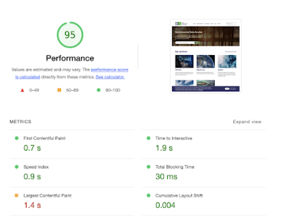
Google Lighthouse is an open-source, automated web page quality-improvement technology. Performance, accessibility, progressive web apps, and more are all audited. It provides a full view of potential user experience and development bottlenecks. We integrate Lighthouse into our build processes so we can use the reports to enhance performance as we build.
Looking at the results of a Lighthouse inspection, we can see that the site is incredibly efficient:
Accessibility
Although Lighthouse can do accessibility testing, we also use aXe developer tools. (The aXe core actually drives Lighthouse.) aXe is a bit stricter, so it's always good to use it for a second opinion where a11y is concerned. In this case we used it to test numerous website URLs (for a typical accessibility audit, this would be around 10 - 15).
Also, although aXe gives you a good start, you still need human checks. We will always manually test sites to verify we cover all of the remaining WCAG 2.1 requirements that a browser-based tool inspecting source code can't necessarily pick up.


