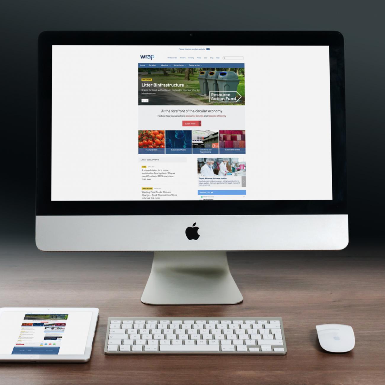
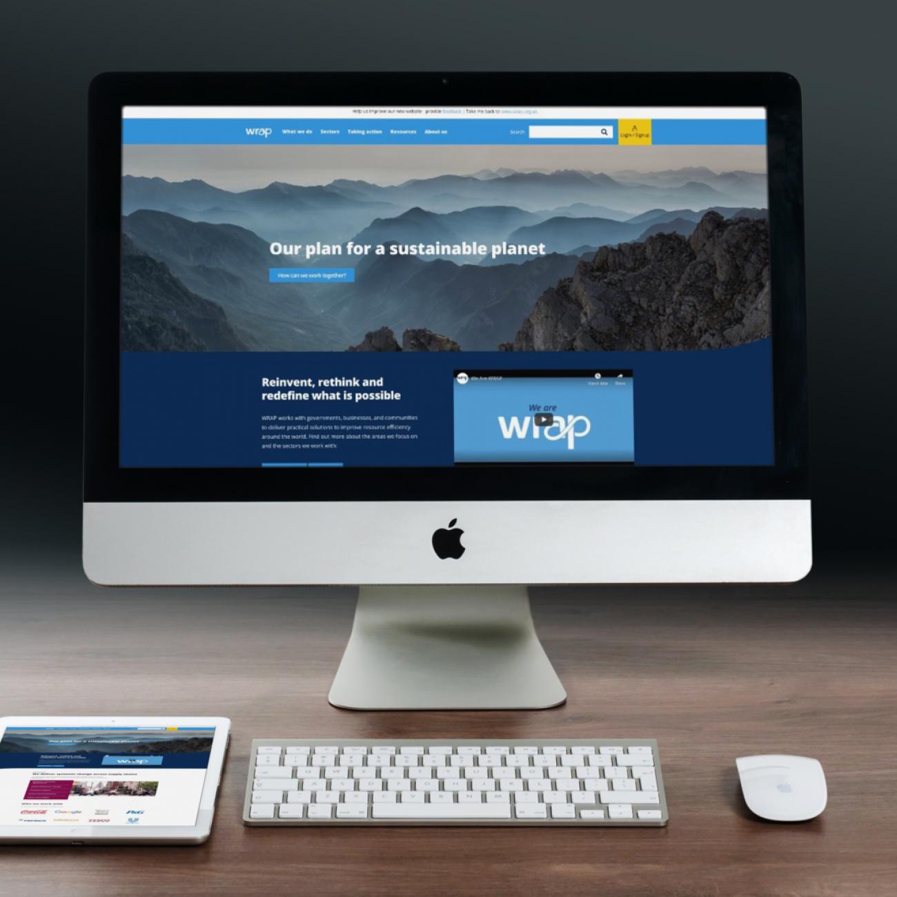
Building a sustainability charity a new Drupal 8 website

The Waste and Resources Action Programme (which operates as WRAP) is a charity that promotes and encourages sustainable resource use through product design, waste minimisation, re-use, recycling and reprocessing of waste materials.
Onboarding
In early 2020, we were asked to complete both front and backend work on the WRAP site. So we led project onboarding sessions with WRAP in Banbury (little did we know this would be our last onsite meeting for a while). As a team, during these onboarding sessions, we got to know the client, the project domain and business objectives.
Listening
We spent a good portion of the time listening to stakeholders. Hearing how the client describes things gives invaluable insight into the domain you’re dealing with. It always helps if everyone involved in the project uses the precise, agreed upon, ubiquitous terms for a thing when talking about it. We call this the ‘domain language’. It also helps flush out ambiguity.
Card sorting and sizing
We asked stakeholders to talk about the project requirements at a high level so we could derive epics and user stories. An epic is a large piece of work that will be broken down into small user stories at a later stage in the project.
Once we captured all of the epics and user stories we ordered them respectively until there was a consensus.
Card sorting and sizing help with prioritisation; it’s vital in apportioning budget and reaching unanimity regarding a minimum viable product (MVP). What happens, as a byproduct, is equally valuable.
As index cards are moved back and forth, discussions take place which further reveals how the client is thinking and about what’s important to the business.
Migration
The migration for the WRAP project was interesting and challenging.
Data sources and the target
There were three data sources to migrate from:
- Firstly, an existing Drupal 6 site (the old, live-at-the-time site).
- Secondly, a version of a partially-developed Drupal 8 site (which had been developed by a company working on the project prior to Code Enigma getting involved).
- Lastly, a Django powered asset management web application with a PostgreSQL database.
Fortunately, our senior developer, Chris, had good knowledge of Django. The target was another version of the aforementioned Drupal 8 project.
Planning
As with all migrations, we like to plan things out first. It’s one of the key things that make for a successful migration project.
In the first instance, we try to get as much of a feel for the source data as we can, especially on projects where it’s not a supported source that has source classes built into the Drupal core migrate (or one migrate related contributed modules).
We do this by examining the database schema. There are a number of tools that can be used to do this, but for the WRAP project, we used the Diagrams visualisation tool in PHPStorm. It creates a diagram of the database showing the tables (including columns) and the relationships between the tables. This insight helps plan which tables we will migrate and whether we need to join certain of those tables to get all of the data we need for a particular destination.
Development
We started with a barebones migration and built out from there. Creating a simple source class and mapping the simplest field first helps us to know we’re migrating the correct data.
As we built out the migration (by introducing more fields to the mapping), we gradually came across cases where data transformations were required. Anyone who’s familiar with Drupal migrations will know you can achieve things in more than one way; you can perform operations in the migration SourcePluginBase::prepareRow method, but you can also chain together Migrate process plugins in your migration config file.
We keep the migration config file simple. The only thing worse than complexity is complexity in two (or more) locations.
We eliminated a lot of complexity from prepareRow by being as precise as possible with our source database queries so further filtering of result rows became unnecessary.
In some cases, this involved using MySQL aggregate functions or PostgreSQL aggregate functions (which are supported in Select::addExpression) so that we then used the PHP explode function in prepareRow or the Explode migrate process plugin in the migration config file.
Front end review
We performed a full audit of all of the existing front end code using a suite of tools including CSSLint and ESLint with Google Lighthouse being used to gather page performance scores. This process gave us useful insight into the codebase. As you’d expect, we found a large number of minor issues (code style and formatting issues) and some errors which would need to be fixed.
We also discovered a fair bit of tidying up was required (unnecessary duplication, inclusion of empty files) and all of these issues, taken together, were causing the site to have a very poor page performance score.
We used aXe to perform an accessibility check on some of the common page types and found a number of issues that we would fix during our development sprints.
Editor and User Experience
As we began to examine how the site had been built, we discovered many Drupal paragraphs had been developed by the previous supplier. In talking to editors, it became obvious they were unclear why some of the paragraphs even existed. They were also unclear which paragraphs could/should be used to achieve what they wanted. On closer examination, we discovered that some paragraphs were poorly named, others were almost exact duplicates and some didn’t work at all.
It became clear that a full paragraphs audit would be necessary. We did this in a separate design workshop where we:
- Agreed on a unified approach to content patterns
- Developed our domain language glossary: established naming conventions for paragraphs and content types
- Fully defined/specified paragraph functionality
- captured user stories for design and development in Redmine
- Evaluated the sitemap with particular attention given to the effectiveness of site navigation
In addition, we spent considerable time listening to stakeholders who were responsible for certain areas of the website. Often we’d simply pull up a page on the website and ask them to explain what the page was about and what it was trying to achieve. This gave us invaluable insight which we fed into the design phase of the project.
Iteration
During the design phase, we worked closely with WRAP to establish a fast feedback loop: iterating ideas with WRAP helped us reach design decisions quickly
We were able to understand that Reports, Guides, Case studies and Tools are the key components in WRAP’s mission to deliver practical solutions to improve resource efficiency.
On the following pages, we give a flavour of the work we did with some of the elements of WRAP’s site.
Resources
- Resources needed to be easy to understand by a number of different people with different skill-sets, job roles and backgrounds.
- Key information needed to be available at a glance for busy people to quickly get the facts they need. More in-depth information might be available via a download or on the page.
- A resource content type needed to be flexible. It may have many downloads, or be a part of a group of information. It may be a link to some software that helps people make decisions based on their needs.
- As well as being flexible, a resource needed to be structured, recognisable and each resource needed to feel familiar to each other.
- We recognised that WRAP needed flexibility because some resources didn’t have a cover page, some were the web page itself and didn’t need a download button.
- When migrating from the old site, many didn’t have much information to fill the page, this needed to be taken into consideration due to the vast amount of resources being migrated.
Implement clear signposting
-
Larger headings within the text allows for easier scanning of the page.
-
Reducing options to editors: Set places for information, such as download areas, related content and tags. This reinforces the connection between all resources making them similar to each other without the need of editors having to remember layout patterns.
-
It was clear that grouped content like the Household Waste Prevention Hub needed more structure to be able to navigate through it, so put back the sidebar menu navigation from the Drupal 6 site, and restyled it.
Use of colours
- The core blues in the WRAP brand guidelines feature heavily on the Drupal 6 website and the header and footer of the Drupal 8 website but the brand guidelines have many more interesting colours.
- Using a key colour for each resource subtly promotes its type and quickly shows a difference between a Tool and Case Study
- The colours have been enhanced to ensure they meet WCAG 2.1 criteria and to freshen up the palette to feel energetic and full of action. Promoting that WRAP is constantly moving forward.
- Yellow as a key colour to run through each Resource type
These techniques of working closely with the client, listening to stakeholders and iterating through ideas enabled us to take the existing front end theme and to transform it into something that works, to something that effectively serves to further WRAP’s mission and deliver valuable, useful resources to users.


